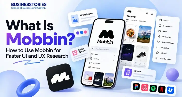
Every designer knows the screenshot trap. You open ten apps and tap through each screen. Then you save dozens of images and lose them in your camera roll. Mobbin resolves this problem. In short, it is a giant library of real app screens and user flows. So instead of hunting for examples, you can search for them in seconds.
In this listicle, you will learn what Mobbin is and how it works. Furthermore, you will get a simple method, clear pricing, and top alternatives. By the end, you will know how to turn Mobbin into a fast research habit.
What Is Mobbin? A Simple Explanation
At its core, Mobbin is a searchable library of real app designs. It collects screens from mobile apps, web apps, and websites that are live today. Then it tags each screen so you can find it quickly. In other words, it is a research tool built on shipped products, not concept art.
The library is big. In fact, Mobbin now holds more than 620,000 screens and over 130,000 user flows. These come from more than 1,000 apps, including names like Airbnb, Spotify, and Wise. Plus, new screens arrive every week, so examples stay fresh.
Who Uses Mobbin?
Mainly, product designers and UX researchers use it. However, product managers, founders, and developers find it useful too. For example, a PM can check how rival apps handle pricing pages before writing a spec. Likewise, a developer can see how a successful settings screen looks before coding one.
Why Real Apps Matter
Here is the big idea. Jakob’s Law says users spend most of their time on other sites. So they expect your product to work like the apps they already know. That is why real-world UI patterns matter so much. When you study shipped apps, you learn the habits your users already have.
Mobbin vs. Dribbble
Many people mix up Mobbin with Dribbble or Behance. But they serve different goals. Dribbble shows polished concepts that may never ship. On the other hand, Mobbin shows what companies actually released. As a result, it is better for practical UX research, while Dribbble suits mood boards.
Our take: Consider Mobbin to be a map of user habits. Each screen shows what millions of people already find normal. So it is more than an inspiration feed. Instead, it is a shortcut to knowing your users before you even test with them.
Key Mobbin Features That Speed Up Design Research
Below are the Mobbin features that save the most time.
Screen and UI Element Search
First, you can search by screen type, such as “login,” “paywall,” or “onboarding.” Furthermore, you can filter by UI elements like buttons, cards, or tab bars. On top of that, AI search lets you describe what you want in plain words. It can even find text in screenshots.
User Flows
Next comes the star feature: user flows. A flow shows every step a user takes to finish a task. For instance, you can walk through a full checkout, sign up, or cancel the journey. Many flows also include videos and animations. As a result, you see small details that a single screenshot would miss.
Collections
Then there are collections. You can save screens and flows into named folders. For example, you might keep one folder for “Onboarding ideas” and another for “Pricing pages.” On the team plan, people can also share folders and leave comments.
Figma Copy and Downloads
Moreover, paid plans let you copy screens straight into Figma. That way, real references sit right beside your own work. You can also download single screens or whole batches.
Mobbin MCP for AI Tools
Finally, Mobbin launched an MCP server in 2026. MCP stands for Model Context Protocol. In simple terms, it lets AI coding agents search Mobbin for you. It works with Claude Code, Cursor, Lovable, and Codex. Furthermore, it offers three search tools: screens, flows, and website sections.
Unique insight: Most reviews treat MCP as a side feature for coders. However, it changes who does UX research. Now a solo founder can ask an AI agent to pull real paywall examples while it builds the page. In short, research moves from a separate step into the build itself.
How to Use Mobbin: A Step-by-Step Guide for Faster UX Research
Using Mobbin well takes a simple system. So follow these steps to get answers in under an hour.
Step 1: Write One Clear Question
First, decide what you need to learn. For example: “How do top fitness apps ask for alert access?” A sharp question stops aimless scrolling.
Step 2: Pick Your Platform
Next, choose iOS, Android, or web. Each platform has its own habits. So mixing them too early can blur your findings.
Step 3: Search Screens, Then Flows
Then type your screen type or keyword. Begin with screens to quickly explore a variety of options. Thereafter, open the flows tab to see the full journey. For instance, the steps leading up to a paywall screen make it look unique.
Step 4: Save 8 to 12 Examples
Now save your best picks into one collection. Aim for 8 to 12 apps. Fewer gives you too little to compare. Meanwhile, more just turns into noise.
Step 5: Count the Patterns
Most guides often overlook this step. Make a quick table. List each pattern you see, and then count how many apps use it. For example, if 9 of 12 apps put “Skip” in the top right, that is a strong user habit. On the other hand, a pattern in just two apps may be a risky test.
Step 6: Note What Is Missing
Furthermore, look for gaps. Which apps skip an error state? Which ones hide the cancel button? These gaps often provide the best opportunity for you to distinguish yourself.
Step 7: Share and Test
Finally, share the collection with your team. Then turn your notes into a quick prototype. Most importantly, test it with real users.
Pro tip: Set a 45-minute timer for each research question. This keeps Mobbin a speed tool, not a time sink.
Mobbin Pricing: Free and Paid Plans Explained
Next, let’s talk money. Mobbin offers four plans: Free, Pro, Team, and Enterprise. Note that it does not sell a monthly plan. Instead, you pay every three months or once a year.
Free Plan
The free plan costs $0. However, it is quite limited. You get a small set of apps and sites, with no flows or animations. Furthermore, search is not included, and you can make only three collections. Still, it is a beneficial way to try the tool.
Pro Plan
The Pro plan suits freelancers and solo designers. It costs $10 per month on an annual billing, or $120 a year. Alternatively, paying every three months works out to $15 per month. Pro unlocks all apps, flows, animations, search, unlimited collections, and MCP access.
Team Plan
The team plan costs $16 per member per month, billed yearly. On quarterly billing, it rises to $24 per member each month. Besides everything in Pro, it adds shared collections, comments, team billing, and API access.
Enterprise Plan
Enterprise uses custom pricing. It adds advanced security, single sign-on, and priority support. So it fits large companies with strict IT rules.
Ways to Save
Yearly billing saves about 33% compared with quarterly billing. Plus, eligible students and teachers get 50% off Pro for up to two years. That is a strong deal for anyone learning UI design.
Furthermore, a $399-per-month add-on called Explore Finance+ covers more than 65 finance apps for fintech teams.
Our view: Do the simple math. If Mobbin saves you just one hour of screenshot hunting each month, Pro likely pays for itself. So the real question is not cost. Rather, it is whether you will develop a habit of using it.
Prices change often. So always check the official pricing page before you buy.
Smart Mobbin Use Cases and Common Mistakes
Mobbin shines in some jobs more than others. Here are the areas where Mobbin is most beneficial and where users often make mistakes.
Best Use Cases
- Competitor research: First, you can review how rivals design key screens. For example, a team building a habit app can study paywall flows from Calm, Duolingo, and Spotify. Better yet, they can walk through the “no thanks” path, not just the buy path.
- Design reviews: Also, Mobbin ends vague debates. Instead of trading opinions, teammates can point to a real pattern in a live app.
- Edge-case checks: In addition, it helps you plan error screens, empty states, and failed payments. These screens are easy to forget. Yet they shape how users feel when things break.
- Learning UI design: Lastly, beginners can study real layouts every day. Over time, such practice builds a strong eye for spacing, order, and copy.
Mistakes to Avoid
- Copying designs: Mobbin itself warns against copying protected designs, branding, or text. So use examples for ideas, not for cloning.
- Confusing popularity with proven effectiveness: Just because a feature is present in a large app does not mean it will increase sales. Likewise, a common pattern is a habit, not always a best practice. Therefore, test before you commit.
- Skipping user research: Mobbin shows what companies built. However, it cannot tell you what your users need. So treat it as a starting point, not the final answer.
- Browsing without a goal: Endless scrolling feels productive. However, browsing without a goal rarely provides answers to real questions. So always start with one clear question and a time limit.
- Ignoring dates: Apps change often. Thus, check the capture date when recency matters.
Fresh angle: The smartest teams use Mobbin to write better test questions. For instance, if half the apps hide the cancel button, ask users how that feels. In this way, Mobbin feeds real research instead of replacing it.
Top Mobbin Alternatives Worth Knowing
Mobbin leads its space, but it is not alone. So here are a few Mobbin alternatives and when each one makes sense.
Page Flows
Page Flows focuses on video recordings of full user journeys. In fact, Screenlane merged into Page Flows in July 2024. So if you like watching guided walkthroughs, it is a solid pick.
Refero
Refero is strong for web design and SaaS pages. It also has its own MCP server. However, its library is smaller, with about 135,000 screens and 10,000 flows. By contrast, Mobbin has over 620,000 screens.
Pttrns
Pttrns focuses on mobile patterns. It is straightforward to browse. Still, its range is narrower than Mobbin’s, and it offers less flow depth.
Dribbble and Behance
These sites work well for visual mood boards. However, many of the shots on these sites are concepts that were never implemented. Therefore, these sites are more suitable for style ideas than for UX research. Still, they can be useful for fresh colors, type pairings, or bold layouts.
Figma Community
Finally, the Figma Community offers free files you can edit. That said, it is not organized based on actual product research.
How to Choose
Here is a simple rule. Pick Mobbin for profound flow research across mobile and web. Choose Refero if you mainly design websites and landing pages. Go with Page Flows if you like video. Meanwhile, use Dribbble for mood and style.
Furthermore, many designers mix tools. For example, they use Mobbin for flows and Refero for quick web layouts. Since both have free tiers, you can test each one before you pay.
Our insight: Library size matters less than fit. A smaller tool that covers your exact niche can beat a bigger one. So judge each tool by one test: can it answer your next research question in under ten minutes?
Conclusion
So, what is Mobbin? Simply put, it is a searchable library of real app screens and flows. With more than 620,000 screens and 130,000 flows, it covers most patterns you will need.
Here are the key points to remember.
- First, start every session with one clear question.
- Next, search screens, and then study the full flows.
- Thereafter, save 8 to 12 examples and count which patterns repeat.
- Furthermore, look for gaps where you can stand out.
Meanwhile, remember its limits. A popular design is not proof that it works. So always test ideas with real users. And never copy designs outright. Pricing is flexible too. The free plan lets you explore at no cost. Then Pro costs about $10 a month on yearly billing, and students get half off.
In the end, Mobbin works best as a habit, not a one-time tool. Used well, it turns hours of research into minutes. Better still, it helps you build products that feel familiar from the very first tap.
Sign up for the free plan today. Then pick one screen you are designing this week and run the seven-step process. You will likely save hours on your very next project.
Frequently Asked Questions About Mobbin
1. What is Mobbin used for in UI and UX design research projects today?
Designers use Mobbin to study real app screens and user flows. It helps with competitor research, pattern checks, and design reviews. So instead of taking screenshots by hand, you search a library of shipped products.
2. Is Mobbin free to use, or do I need a paid plan to get full access?
Yes, Mobbin has a free plan, but it offers little. You get a few apps, no flows, and three collections. For flows, search, and MCP, you need Pro at $10 per month on yearly billing.
3. Can I copy Mobbin screens straight into Figma for my design work?
Yes, paid plans let you copy Mobbin screens into Figma. This helps you place real references next to your designs. However, use them for ideas only, since Mobbin warns against copying protected designs or branding.
4. How does Mobbin differ from Dribbble for UI and UX design inspiration?
Mobbin shows real screens from apps that actually shipped. Dribbble, on the other hand, shows polished concepts that may never launch. So Mobbin suits practical UX research, while Dribbble suits mood boards.
5. Does Mobbin work with AI coding tools like Claude Code and Cursor?
Yes. The Mobbin MCP server links AI agents like Claude Code, Cursor, Lovable, and Codex to the library. It needs a paid plan. Then your agent can search real screens and flows while it builds.

Tabassum Shaik is an Author, Researcher, and SEO Specialist with over 8 years of experience creating informative content on business, startups, entrepreneurship, marketing, technology, and digital trends. She specializes in researching industry trends and transforming complex topics into practical, easy-to-understand insights. Her goal is to help readers stay informed, learn new ideas, and make better business decisions.